01 / The client
Project overview: Lavie World
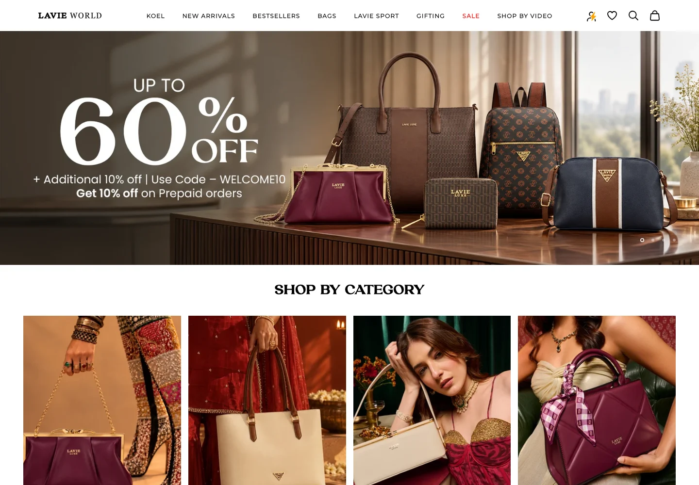
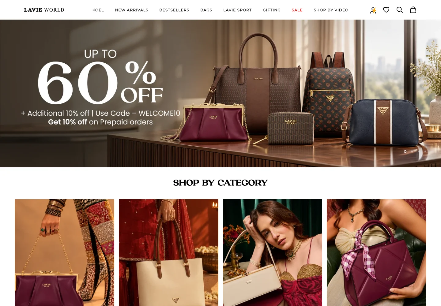
Lavie World is a fashion-accessories storefront centred on bags and related products. Its public presentation combines category browsing, curated collections and brand content. The ecommerce case study focuses on bringing those elements together so a customer can move from a visual style preference to a particular item and continue into a familiar online shopping journey.
Make a style-led accessories assortment easy to browse, with clear distinctions between product categories, curated edits and practical after-purchase support.
- Industry
- E-commerce & On-Demand
- Services / expertise
- Shopify eCommerce · Shopify · Bags & Accessories
- Client
- Lavie World
- Platform
- Shopify
- Industry
- Fashion bags & accessories
- Client website
- Visit Lavie World ↗
Planning a similar project? Explore our eCommerce development services.
02 / The project
Storefront requirements
Clear accessories categories: The store needs product-type destinations that help shoppers narrow the range before comparing individual items. Category naming should be consistent between navigation, collection headings and product information.
Style and occasion merchandising: Curated edits provide a way to introduce the range through a theme or intended use. These groupings should function as discovery routes into the catalogue, rather than creating an unrelated set of products with different commercial information.
Search and selected products: Visitors who already have an item in mind need a direct discovery route, while others need an introduction to the assortment. Search and product merchandising should work alongside visual campaigns rather than compete with them.
Post-purchase access: Order support, returns information and warranty-related content need to remain discoverable after the sale. The website should make those routes understandable without mixing them into the primary product navigation.
03 / The project
Design and catalogue challenges
A broad style vocabulary: Fashion collections can use editorial names that are meaningful to the brand but unfamiliar to a new shopper. The interface needs to connect that language to product types and readable catalogue destinations.
Colour and design variation: Similar formats may be presented in several colours or visual treatments. The product journey should make the currently selected item clear and avoid relying on a small swatch or campaign image alone.
Campaign density: Collections, bestsellers and media content can crowd the homepage. The challenge is to give each block a clear task so a visitor can keep shopping without reading every promotional section.
Support across systems: Some after-purchase routes can lead to external services. The link label should explain the task and preserve customer confidence as the visitor leaves the main storefront for a specific support activity.
04 / The project
Shopping experience
Category-based bag discovery: Product-type navigation gives customers a stable route into the range. This supports shoppers who know the format they need and provides a practical foundation underneath the more editorial collection language.
Curated collection presentation: Style-led edits organise the catalogue around a theme. Keeping each edit connected to normal product records allows the visual campaign to change while shoppers still see consistent item information and purchase controls.
Product discovery beyond the menu: Selected product and search entry points support different customer intentions. A visitor can start with a specific query or browse a highlighted assortment without being forced through the same long menu sequence.
Brand and media context: Editorial and media sections provide a broader view of the brand. Their role in the ecommerce experience is to add context while keeping primary shopping actions easy to find, rather than replacing product information with publicity content.
Dedicated after-purchase routes: Order tracking, returns and warranty information have recognisable destinations. Separating these tasks from general contact helps a returning customer choose the appropriate support path without restarting the shopping journey.
05 / The project
Merchandising and operations
Collection and product alignment: Review category assignments, curated edits and imagery together. A change to a collection title should not leave a search suggestion, campaign image or product link describing a different selection.
Support link governance: Maintain ownership of external support destinations and periodically review them. The customer-facing label should continue to describe the actual action available on the destination page.
Publishing and media control: Keep press, campaign and catalogue updates in clearly separated content workflows. This gives brand storytelling a place without allowing promotional material to overwrite the information used for a transaction.
06 / The project
Launch review checklist
Category and edit paths: Reach the same product through a product category and a curated edit, checking for consistent identity.
Variant presentation: Confirm that product imagery and cart information reflect the option selected by the shopper.
Support destinations: Open order, return and warranty routes and verify the destination and the meaning of the link label.
07 / The project
Project outcomes
A structured accessories store: The storefront combines a product-type catalogue with style-led discovery in a coherent branded retail environment.
A clearer customer lifecycle: Shopping and after-purchase support have distinct routes, helping customers continue with the task they actually need to complete.
A repeatable collection framework: New edits can be introduced within a stable product system instead of requiring the catalogue and support journeys to be rebuilt for each campaign.
Technology used
Project profile based on the supplied Bizzeonline ecommerce case-study material and documented public storefront. No sales or conversion uplift is claimed. About the team.