01 / The client
Project overview: Hidesign
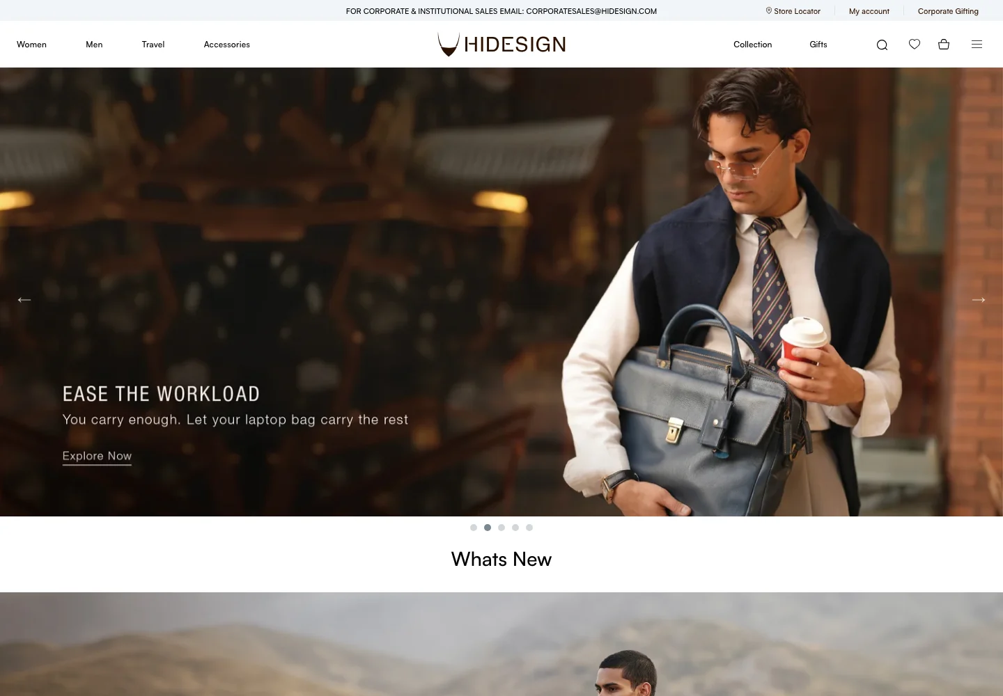
Hidesign presents leather bags and lifestyle accessories through a retail experience in which material, product detail and brand identity are closely connected. The ecommerce project focuses on giving that premium presentation a usable catalogue structure, so customers can discover a product, evaluate it and find appropriate support without separating the brand story from the shopping journey.
Combine premium product storytelling with clear category navigation, individual product detail and recognisable customer-service pathways.
- Industry
- E-commerce & On-Demand
- Services / expertise
- Shopify eCommerce · Shopify · Bags & Accessories
- Client
- Hidesign
- Platform
- Shopify
- Industry
- Leather bags & lifestyle accessories
- Client website
- Visit Hidesign ↗
Planning a similar project? Explore our eCommerce development services.
02 / The project
Storefront requirements
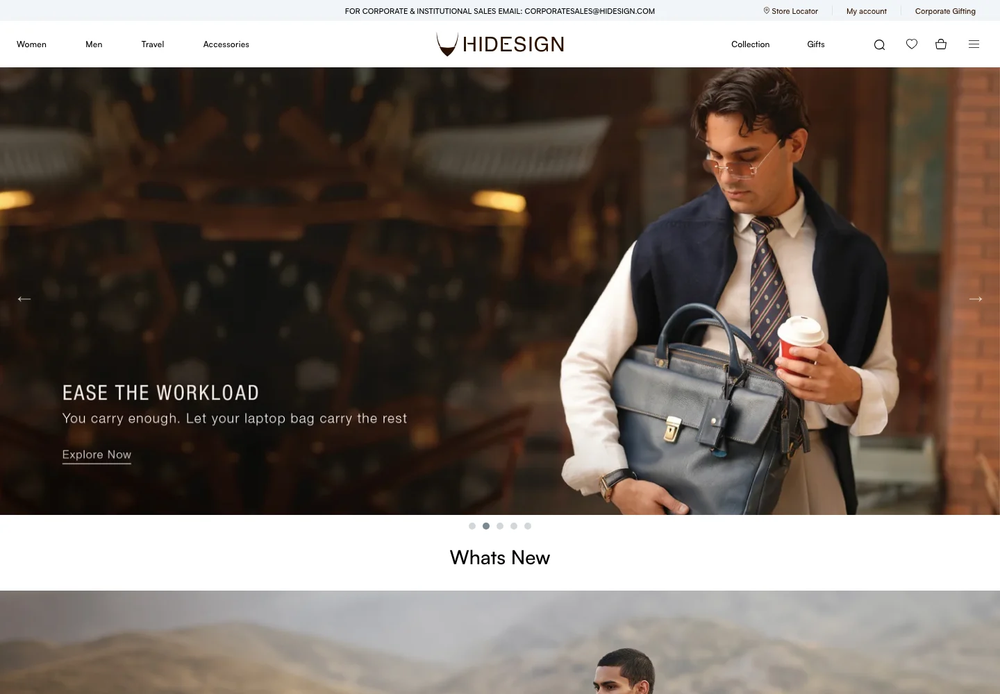
Premium visual presentation: The storefront needs to communicate the character of the range through photography and readable content. Image-led design should still make the product identity and shopping action clear rather than asking visitors to interpret a campaign without a destination.
A varied accessories catalogue: Different product families need understandable collection paths. The catalogue should preserve a consistent shopping vocabulary across promotional material, category pages and the product detail view.
Brand and care information: Material and brand stories need room in the experience, alongside practical information that helps a customer understand ownership and product care. Editorial content should support the item journey without replacing its factual details.
Retail and customer support: Store information, gifting and customer-service content need dedicated destinations. These routes should be clearly labelled so the visitor understands whether the next step is online shopping, a retail visit or a support enquiry.
03 / The project
Design and catalogue challenges
Detail within a premium layout: A restrained visual style can leave important information too far from the product image. The challenge is to preserve the tone while keeping comparison and purchase information discoverable.
A category system across formats: A bag, a wallet and another accessory create different shopping questions. Navigation should communicate product types clearly without making the range feel like disconnected stores.
Content and commerce balance: Brand stories can add context, but shoppers may arrive with a specific item in mind. The experience needs a clear route to the catalogue even when the current campaign emphasises an editorial theme.
Multiple customer tasks: A customer seeking care or store information should not have to enter a purchase flow. Customer-service and product-discovery paths need to remain related while serving different intentions.
04 / The project
Shopping experience
Campaign-led product introduction: Large campaign images introduce the visual world of the range. Connecting these images to relevant shopping destinations allows the brand presentation to support a product journey rather than function only as decoration.
Clear product-category entrances: The catalogue offers product-type routes that help customers narrow the range. Readable labels and a consistent collection structure are especially important when the first impression is strongly image-led.
Individual product presentation: Product imagery, naming and commercial information provide the basis for evaluating an item. The interface should keep the selected product clear as the customer moves between a collection, detail view and cart.
Brand and ownership context: Story and care content give customers another way to understand the brand and its products. These destinations are most useful when their relationship to the catalogue is clear and when care information is distinct from a sales promotion.
Store and support access: Dedicated retail and assistance routes extend the relationship beyond a single transaction. They support visitors who need a location, a product question answered or a specific customer-service task completed.
05 / The project
Merchandising and operations
Image and information standards: Set consistent expectations for product views, naming and descriptive fields. A premium appearance depends on the quality and coherence of catalogue data as much as on the homepage campaign.
Editorial content ownership: Maintain a review process for brand, care and product information. A story page and a product page can have different purposes while still requiring consistent and merchant-approved statements.
Customer journey maintenance: Review store links, support information and purchase destinations when the catalogue changes. A polished homepage is not enough if a returning customer reaches an outdated assistance route.
06 / The project
Launch review checklist
Catalogue orientation: Open each main product category and confirm a clear path from the campaign to an individual item.
Product continuity: Verify the selected product and option remain recognisable across detail, cart and review states.
Customer-service navigation: Check store, care and assistance destinations independently of the online checkout journey.
07 / The project
Project outcomes
Premium presentation with a retail purpose: The storefront connects image-led brand communication with usable catalogue and product pathways.
Support for the ownership journey: Customers have routes for information beyond the initial purchase, including brand, care and retail context.
A reusable content foundation: A stable catalogue and editorial structure can accommodate changing campaigns without requiring the core customer journey to change with every visual update.
Technology used
Project profile based on the supplied Bizzeonline ecommerce case-study material and documented public storefront. No sales or conversion uplift is claimed. About the team.